Penny Stocks – Have a System For Trading

Hey Penny Stock Players! 

If you are currently trading stocks but are losing money regularly, STOP! Do not trade another stock until you read all the posts that are posted and are going to be posted on this blog.

 You will learn the secrets to picking a stock that is being traded, how to read charts, how to read level 2, where to find and read current news and press releases, how to research the CEO, how to confirm the stock’s share structure, and many more techniques employed by the most talented and profitable penny stock traders as they rake in the profits that are stolen from traders who do not possess this knowledge.

 The penny stock world is cut throat and full of deceptive traders out to steal your money. 

 I know because I was once a newbie myself. And that is why I want to share my knowledge with you. I lost 80% of my trading capital in my first month or so of trading. But I’ve made it all back since and, although I still have losses, I make more money with my wins than I lose with my losses. And that’s key! 

 A major trick to trading profitably is to have a system for trading. This system must have a consistent percentage gain that is required and a consistent percentage loss that is tolerated with each trade. 

 This means that, let’s say you want 50% profit from every trade. You should then sell for 50% profit for EVERY winning trade. AND your loss percentage should be half your gain percentage. This means if you want 50% profit, you should only risk 25% loss. 

 Why do you want half the gain percentage as your loss percentage with each trade? That way you can lose twice for every win and still be even! And if you are 50/50 with your trades, you are still profitable.

For example, if you put $1000 into a penny stock and it trades against you and you hit your risk tolerance and have to sell for a 25% loss. Well, you still have $750 to trade with. Now, you put that $750 into a penny stock and you win and you sell for a 50% profit. So now you have $1125 and you are up $125.

See how that works? Simple! 

And you just keep that system and make sure you are smart with your trade. Do your due diligence, do your charting, and make sure you a) know what you own and b) have NO reason NOT to trade the stock.

That way you can’t blame yourself if the stock trades against you. 

 AND when charting, there are three very important indicators to look for:

1

.   Look for the 10 day moving average to be crossing up through the 50 day moving average OR look for the 50 day moving average to be crossing up through the 200 day moving average. (The former is more consistently profitable but the latter is what we call a golden cross and can be very explosive in its potential gains).

 2.   VOLUME, volume, volume!!! There must be volume in the chart either prior to the day you buy or on the day you buy. This shows that traders are trading the stock. You don’t want to buy a stock that has no volume unless you have Zen-like patience and know for certain that volume is coming. If you don’t trade a currently high volume trading stock, you risk holding bags for an indefinite amount of time. *NOTE: one caveat to volume is if price rises too fast too quickly, if you trade it, get in and get out as quickly as possible.

 3.   Look for a bottomed On Balance Volume (OBV) line. This indicator, on the chart, shows whether a stock is over-bought or over-sold. If it is bottomed, it means that the stock is over-sold.

Use these three indicators in conjunction and watch your profits grow. But remember, there are support and resistance levels to watch for and to stick to your profit vs loss system.

 You can find the previous blog post about the 10 day moving average, including chart examples, by clicking HERE.

 Comment below with your thoughts and recommendations. I’d love to learn from you as much as you learn from me. If you have a profitable system, please, share it below in the comments section. 

 And don’t forget to follow us and tell your trading buddies about us. There will be plenty more blog posts to come in the future. So stay tuned!

How to turn a loss into a gain

Hey Penny Stock Player! We meet again and in much better shape for our initial alert of #BETS. Why? Well…I played it correctly. This is how I turned my loss, into a gain of 40+%.

But before we get to that, let’s take a look at the previous alert of #BETS.

I initially alerted #BETS at .0016 and took a position myself at .0016. However, it quickly turned against me. And before I knew it I was down at .0014. But the question was why. All my due diligence pointed to an upward swing of the ticker. But instead, it continued to crumble.

To see the history of this alert, click here.

A quick call to the TA or CEO to get an updated share structure would have revealed my folly. Even though they are presented as a reporting up-to-date company, their share structure, as reported by OTCMarkets.com was way off! OTC Markets shows that #BETS has close to 10 million shares outstanding, when it’s actually closer to 600 million.

They also reported that they were finishing a converted note. So, in effect, I entered the position a little to early. I should have waited for the entire note to completely finish converting.

If you want to see the update on #BETS after my alert, click here.

So…before I took action, I was down to .0013. I sold there for a loss of 18%, calculated as (.0016-.0013 = .0003, then, .0003/.0016 = 18.75%).

But I did not give up on the ticker. I kept it on close watch. And as level II shifted back positive, it had been beaten down to .0009. So I bought back in at .001 as it looked like the conversion was over and the ticker was about to bounce.

Of course, you know it did. Today, I sold #BETS at .0016 for a 60% gain. So, in all, I made 41.25% on #BETS. A nice bounce play and a great example of how you can turn your losses into gains.

The key: cut your losses short and let your gains run until they reach your goal. Develop your system and stick to it no matter what. If you have a risk of let’s say 20%, your upside desire should be higher. I usually do double. So if I’m risking 20% in the red, I’m going to try to get 40% gain on the stock.

This method cuts your losses short and allows your gains to make up for it. And as long as your gains are higher than your losses, you will remain green.

For this example, in order to get my 40%, I had to let the stock run 60% because I had already taken close to a 20% loss. I’m not saying that you have to sell at 20%, but if you are going to hold, make sure you average down so you lower our position. If I were to double my position in #BETS at .001, I would have then been holding an average position of .0013. Then I would have been up 23.1% (.0003/.0013).

As you can see, 23% is less than 40%. So, in effect, by selling rather than averaging down, I nearly doubled my profits. There is no right or wrong between these two methods. However, selling not only limits your exposure by cutting your losses, it also affords you the opportunity to buy back in fresh, and if you have the funds, increase your buy in price thereby increasing your money gain and your percentage gain.

So what’s the lesson? Trust yourself! If you feel your call is good, it’s okay to sell out of the position if it turns against you. However, keep it on watch and buy it back when it bottoms. DO NOT get pissy and give up on the ticker and say it’s a POS and bash it. That’s childish and does no one any good. We’ve all see on message boards and social media those traders who got burned once on a ticker and spend the rest of their lives bashing it, right? Don’t be that guy, or gal!

Make the trade. Don’t get emotionally attached to it. Take your loss like an adult. And move on. But trust yourself, develop your system, and follow your system.

There’s no such thing as a bad trade if you follow your system and learn from any mistakes that are made. Hey, sometimes the ticker just doesn’t do what you knew it was supposed to.

To this I say: Get Out! Unless you’re like me and you play these sub-penny trip plays (triple zeroes). The movement is so vast with every tick when trading trips, that, unless the ticker is about to reverse split, there’s no sense in selling if it drops in price. Then again, these are so risky and volatile, there’s also no sense in either entering the position with more than a very small percentage of your capital or selling unless the reverse split is announced because the second you sell it bounces!

Yes…the market knows you’re coming!! …or going.

Here’s the annotated chart of the #BETS trade:

BETS22

Okay, friends, that is all for now. If you like this post or have any suggestions, comment below and share this post with your friends.

Let Your Profits Get High On Marijuana

Hey Penny Stock Players, DO NOT invest in a single marijuana stock before reading this post!

Weed was initially legalized in the United States by Colorado on November 7, 2012. The moment marijuana was legalized, there were tons of penny stock companies who jumped on the opportunity to promote their stock and claimed to be entering into the marijuana industry.

Many of these companies though were found out to be frauds and have since been penalized by the government and the SEC either through fines or suspensions. But each year, about this time, there’s a new influx of traders trading the marijuana industry, which you will be able to see by the following charts.

Well, my friend, the time is upon us once again as we’ve seen IJJP and THCZ ride this marijuana puppy up to tremendous gains. IJJP ran from .0006 to .006 in a matter of months. THCZ ran from doubles (around .007s) to up to .268 for a gain of 37 times your money in two months.

Now, obviously, you wouldn’t reasonably ride it all the way up. The smart thing to do would be to buy at support and sell at resistance with stop losses in place that also move up as the price moves up. OR, sell a percentage of your shares and ride freebies to a ridiculous gain.

Even by sticking to your system that you’ve developed over time, you could have traded either IJJP or THCZ for multiple support buys and resistance sells.

Now, let’s look at a few charts. Since we started off talking about IJJP and THCZ, we will look at them first.

Here is IJJP’s chart:

IJJP

IJJP had a small run in March through June of 2014. But the true run didn’t start until November of 2015. Coincidently, the run came after the 50 day moving average dipped below the 200 day moving average and then crossed back up to form a golden cross. But the golden cross means nothing without volume, which, at the time, IJJP had plenty of. Look at that volume coinciding with the golden cross in late October of 2014. That’s a long term buy signal if I’ve ever seen one!

Next, we look at THCZ:

THCZ

The yellow circle indicates the golden cross and the blue box shows how the volume increased a week or so before the cross occurred. Of course the volume wasn’t out of this world, but it was more than quadruple what had been pouring into the stock.

I did not put other indicators on either chart but you can clearly see there are multiple dips that you could have bought on the way up, if all of your trading rules are met during the dip. However, one indicator, the RSI has dipped almost to 50 before it popped back up for the next leg. Also, check the press releases and news because they often also tell a story.

Now let’s look at the FITX chart:

FITX

FITX, as noted by the yellow circles, had two golden crosses; one around April of 2012 and the other around January of 2014. The first golden crossed proved to be profitable despite basically no volume. However, look at how much further the second gold cross ran with WAY much more volume. FITX ran from doubles to 12 cents! I’m sure you can calculate the percentage gain there. And that was in a matter of two months.

The next two charts, MJNA and ERBB look almost identical. Here are their charts:

MJNA

ERBB

Okay, so they are not exactly identical, but you can see the pattern. The top chart is MJNA and the bottom chart is ERBB. As you can see, they both had two golden cross with the second one, on both charts, showing more volume. However, MJNA’s first run was massive because it had another influx of high volume before the steam ran out of the run.

The orange diamond on both charts indicates another potential golden cross opportunity. But look at the volume on both charts. It is practically non-existent. You would be wise to wait for confirmation of the golden cross AND for volume before predicting a move north. But keep an eye on them for the interest in marijuana stocks is picking up again.

Finally, we will look at two more charts: ILIV and VMGI. Here is the chat for ILIV:

ILIV

ILIV has been beat to death. Man, what a dump fest. However, notice how recently the volume has picked up as noted by the blue box. Obviously, check with the CEO and the TA for true share structures and make sure they aren’t planning a reverse split. Also look through the PRs and the News to see if anything positive is in the works. But for a pure trade perspective, if all your rules check out, ILIV might provide a nice bottom feeder bounce soon. Again, I have not done any research on this stock except for looking at the chart. So do your own full due diligence before entering any trade.

And finally, here is the VMGI chart:

vmgi

Man, this stock used to move on air. The two golden cross proved successful with little to no volume. In fact, the second golden cross came AFTER a substantial move north, also on almost no volume. You ask yourself, why does this stock now require so many more shares traded to move? Because the share has been diluted and as it gets watered down, the price decreases and more shares must be traded to weed out the 1 tick flippers.

Time will tell where this is headed. But if history repeats, VMGI will have a huge run coming.

There you have it. A look at the marijuana industry. Who will provide the next big run? ILIV? ERBB? VMGI? MJNA? Another weed stock? Only time will tell. So keep an eye on the stocks in the sector and follow your rules as you catch the next ride north!

If you liked this blog or have any suggestions, please comment below. And don’t forget to read our other posts and follow us as there are many more posts to come.

Penny Stock Alerts – March 22, 2015: BETS

Our next penny stock alert, since #VMGI is currently channel trading from .0005 to .0008 for consistent 60% gains, is #BETS. $BETS closed on Friday, March 20, 2015 at .0017 a share. However, the PSAR has been riding the top of the price channel for quite some time now and is getting ready to flip back to the bottom as a bullish buy signal.

But before we get into that and the penny stock chart, let’s first look up the ticker symbol $BETS on OTCMarkets.com and click on “Company Profile” to see what its share structure looks like.

Currently, the penny stock #BETS has 2 Billion Authorized Shares and only 74, 721, 445 Shares Outstanding, including only 10, 170, 199 shares in the float. However, if you look closely, you will see that these number were reported in 2014 and 2013.

For an updated share structure, you could easily call or email the company and simply ask. Most penny stock companies are more than willing to update their shareholders with the most up to date information.

With that said, the actual current share structure, according to the T/A for $BETS is still 2 billion Authorized Shares, 543, 163, 216 Shares Outstanding, including a float of 510, 275, 137 shares. Of course the penny stock company has increased their share structure considerably, however, compared to the share structure of $VMGI, $BETS is amazing!

Considering the fact that $VMGI has, according to their T/A, over 4 billion Authorized Shares, 3.2 Billion Shares Outstanding, and a float that consist of most of the Shares Outstanding, $BETS has a much better share structure and can be considered to have a low float. Additionally, according to the T/A, $BETS has plans to reduce their Authorized Shares to 850 Million.

So, obviously, $BETS has a very good share structure and, therefore, trades according and is volatile enough to provide a nice chance to make a profit without much fear of becoming a bag holder. ***WARNING: A low float and great share structure means volatility. In the penny stock world, however, you want volatility because that’s how stocks move.

Normally, we would look at the chart first. However, in this case, we already knew that the chart was great. So now, without further ado, let’s take a look at the chart for ticker symbol $BETS:

BETS

By trading $BETS now, we are getting in a little early. The 10 day moving average has not yet crossed up through the 50 day moving average and the PSAR has yet to flip. However, $BETS is now trading in a nice channel which can be seen on the chart from .0015 to .0023 for 53% gain in the channel.

It is safer to trade these channels, buying in at support and selling at resistance, than it is to buy in a penny stock and expect to ride it “all the way up” as we say in penny land. Plus, you never really know if the channel is going to be broken towards the upside or towards the downside. So, remember, if a stock moves up thousands of a percent, still you should buy at support and sell at resistance. If you do not take profits on the way up, you risk losing all your gains.

Unfortunately, OTCMarkets.com has not registered the new or press releases that $BETS has released. Therefore, we go to Ihub.com and search for “BETS”, then click on ‘news’.

Here, we will only discuss the important news releases, starting with this one: On January 26, 2015, the company was issued another 5 million in debt financing which was added to the 100 million that they had already received. On January 30, 2015, $BETS announced that they have enter into an exclusive marketing agreement with Overseas BC marketing, Inc. for revenue sharing and for the use of bitoin.

Then on February 3rd, they announced that they had a gross profit of over $74,000 for the month of January, their largest ever. On February 30, 2015, $BETS announced their plan to reduce the authorized shares to 850 million. On March 10, 2015, they signed a joint venture to issue bitcoin debit cards and huge news that they had finished converting Redwood Fund II LLC debt.

Then huge news came out on March 16, 2015 that they had just converted another note from LG Capital Funding LLC, which came into effect on March 11. This means that they have fully converted and paid two debtors in full.

There you have it. The chart looks like it provides a great channel trade at the minimum, they are paying off debt even if it’s through selling shares, they are making deals to bring in more revenue and that bodes well for the financial aspect, and the share structure is excellent for a penny stock.

If you would like more information about the Penny Stock Players blog, then please click here to visit our welcome page.

And if you enjoyed this blog, please share it with your friends. You may also join our email subscribers by clicking the menu in the upper right hand corner and entering your email address in the box provided to get new blog posts sent directly to your email.

Penny Stock Investing: How to spot Trades for the LONG TERM

Conventional wisdom suggests that when trading penny stocks it simply should just be a trade. However, sometimes you find those rare opportunities in which you can invest or at the very least hold long-term for greater gains with your trades. It is still wise, that when trading for the long term, especially in penny stocks, that we trade at multiple levels. What this means is that we buy at support and and sell at resistance. These support and resistance points increase as we ride the chart up an uptrend.

This is not always the case. But it is a safer way to trade. This blog post is going to analyze two penny stocks charts that are very similar. One has already established an uptrend, and one that is beginning to start an uptrend.

Although this blog has focused mainly on charting, this is not the only way to evaluate these penny stocks, especially when investing or trading for the long-term. A prudent trader must also research the CEO and look at the financials as well as news and press releases to see in what direction the company is actually going. And any information that is gathered during this due diligence process must also be fact checked through other sources and by consulting other traders that are well-established. However, every trader should make his or her own decision and not rely on another’s opinion to change his or her mind although taking consult is wise.

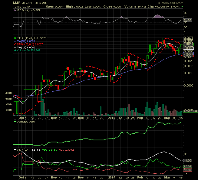
The first chart we are going to look at is for the stock ticker symbol $IJJP. This penny stock ticker symbol started in the trips and has since gathered steam and has been trading in the .003 to .006 range for the past few weeks. $IJJP has consolidated and is ready for its next leg.

Now let’s take a look at the chart and see what is going on here. Here is the $IJJP chart:

IJJPblog

Now, before we analyze this chart, let’s also take a look at the other penny stock chart that is eerily similar.

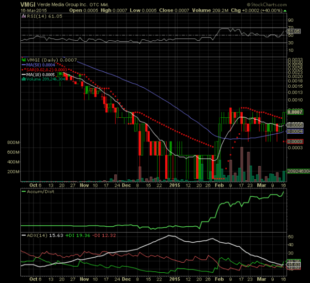
Here is the chart for the penny stock ticker symbol $VMGI:

VMGIblogBefore I show you the annotated charts, I’m going to give you a minute to see if you can see the pattern for yourself. Also before I show you the annotated charts, I’m going to go through and show you some of the news, press releases, and headlines as well as some of the financials that has caused traders and investors to jump into these companies.

And then once we establish that these are companies that you should at the very lease take note of, we will then analyze a chart to look at the similarities between.

News and Press Releases for $IJJP:

To begin to analyze the penny stock $IJJP, we first must go back to January 19, 2012 when $IJJP released this news release informing investors that it had ceased selling 504 stock. 504 stock, in layman’s terms states that the company is exempt from federal registration as long as they sell up to $1,000,000 worth of stock in a given 12 month period. Ceasing a 504 stock sell is HUGE for the turn around of a failing company in the eyes of investors and traders. To learn more about 504 stock selling, click here.

Then we jump to December 19, 2014, a date on which $IJJP released this news release informing investors that it had closed on two deals bringing in $2 million and $100,000 yearly, respectively.

Then in the next few news releases, $IJJP released interviews with the CEO and spoke of deals being worked out with other companies to promote business and bring in revenue. These news releases can be seen on $IJJP’s page on OTCMarkets.com. The company also released multiple press releases informing investors of new hiers and how they are establishing an incredible roster of executives to head the new business model intended on turning around the company and making it profitable.

Then, the final piece to the puzzle, not only were deals done and revenue brought to the company, but $IJJP also hired an amazing staff to run the company and the icing on the cake: a buy back of hundreds of thousands of shares! You can find information on the number of shares that the company has bought back or intends to buy back on the company’s page on OTCMarkets.com.

Now, since we’ve establish that this company has taken the steps necessary, financially and executively, we can now analyze the chart to see how it stacks up and lines up with these deals.

Here is the annotated penny stock chart for $IJJP:

IJJPblogAnnotated
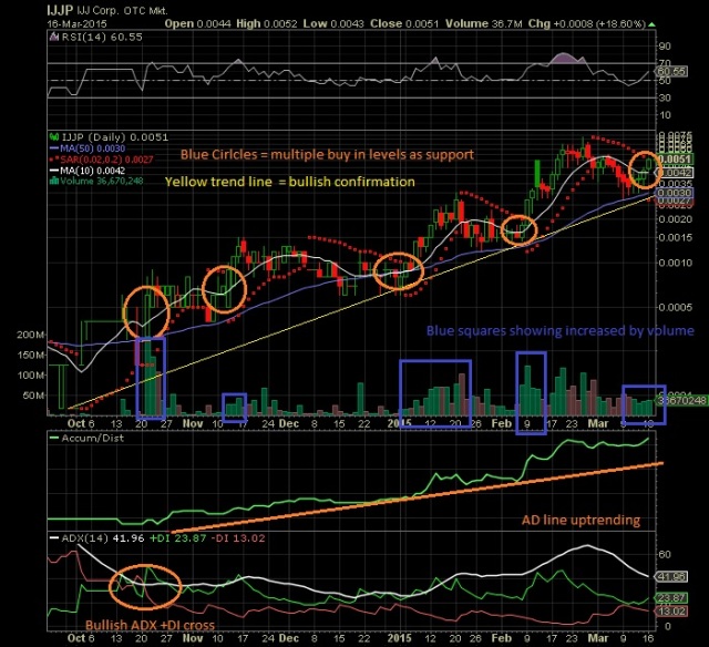
So, as you can see, the stock price has continued to increase as the press releases and news from this transparent company has informed the investors of its workings. The stock has turned into a text book bullish run and I predict the run will continue into pennies. Now, will this eventually crash? It is hard to say. But it does not seem like a normal pump and dump in the sense that the company is actually closing deals and bringing in revenue. The executives are not blowing smoke or making promises that they cannot deliver on. They have proven that they will make true of all their promises. And the stock price has reacted accordingly with the next leg up approach. And, according to the chart, the next leg is up and should push into penny land.

Financials

It cannot be determined what the financials of the company will look like in 2015 for they file in October. The net tangible assets have been positive from 2011 through 2014, however, the last three years, the net tangible assets have declined slightly. We, at Penny Stock Players, predict that the 2015 balance sheet, if all aspects of their press releases, news headlines, deals, share buy backs, and promises come to fruition, will be much more to the liking of investors and will show that $IJJP is beginning to establish itself as a reputable company.

News and Press Releases for $VMGI:

For $VMGI, we must first go way back to May 1st, 2014, which is very early since we are just now seeing price movement in the positive direction. On that date, there was this press release which informed investors of a major distributor for their BeautyJect products. Also in May, there were two other press releases which can be found on OTCMarkets.com, that indicated that they closed on deals in Asia for medical cannibals oil and omega 3.

The next few months, the penny stock company $VMGI released multiple press releases about BeautyJect and their Asia deals. And on November 19, 2014, they released a press release stating that they had hired a new CEO for their New York Agency division. You can find the press release here.

On December 23, 2014, $VMGI announced that they had signed a contract with Port City Coffee Roasters. You can find that press release here.

Then a huge press release was released on January 20, 2015 asserting an asset valuation for their BeautyJect division. The asset valuation comes to 175 million dollars and you can find that press release here.

All of these press releases and news can be found on OTCMarkets.com under the company’s page. So, we will now just headline these press releases for you. On the dates, February 2nd and 6th of 2015, $VMGI informed investors that they are moving forward with a reality TV series called “Green Rusher” which details the marijuana industry and will bring 100% of the revenues to the company.

Then on February 17th and March 16th of 2015, the CEO, Mr. William Veve, hosted a conference call for its investors to first talk about the company and its deals, and second to allow investors to ask any questions.

More information from the press releases: There are two additions to the company, Mr. Aaron Courseault, who you can find out about on IMDB.com, and also Mr. Kevin Harrington. Additionally, accompanying the BeautyJect deal is a share buy back. There is also NO reverse split planned. The company has become extremely transparent just like $IJJP by not only having the CEO give monthly conference calls and interviews, but also they host a Sunday blog where the CEO details the week’s progress. And like $IJJP, $VMGI is in the process of getting their financials audited. This means more transparency, current status with the SEC, and more confidence amongst shareholders.

So, as you can see, the parallels between $IJJP and $VMGI are unprecedented and, we at Penny Stock Players, assert that the price per share will also run parallel. As noted above, it has already started.

Now, lets look at the annotated chart for the penny stock $VMGI:

VMGIblogAnnotated
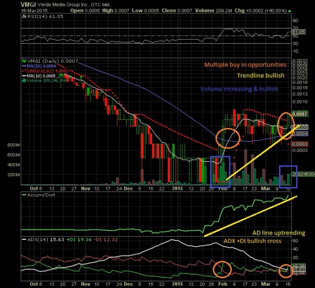
$VMGI is under major accumulation and has effectively begun an upward trend with the first leg in place. The #VMGI chart looks very similar to the #IJJP chart. The chart predicts that an uptrend and long term run is imminent and as long as $VMGI remains transparent with their shareholders and remains true to their word, the price will continue to react positively. *NOTE: $VMGI’s chart has only just finished its FIRST leg. Look only at the forming uptrend and NOT at the previous decline. 

Financials

As with $IJJP, $VMGI cannot be accurately assessed financially. Their last file date was in 2013. Therefore, we must wait for the audited financials to be released. However, since they are still in the infancy of their current deals, it is unfounded to suspect a great current financial statement. The 2016 financial statement will reflect the 2015 revenue brought to the company via BeautyJect, Green Rusher, their Rum product and many other divisions. However, once the deals are finalized, the price will react accordingly regardless of their SEC filed financials; which will just be the icing on the cake for $VMGI in the future. By the way, $VMGI seems to file in December, however, through Mr. William Veve’s current conference call on March 16, 2015, new audited financials will be released in April of 2015.

So, what is the point of all this?

If a trader did his due diligence and saw what was coming for $IJJP, even if he did not trade it, he would now be afforded an amazing opportunity to trade $VMGI and make a nice buck. She will also be able to use the previously laid out blueprint to find other trades that will also afford a great opportunity. Remember though, haste makes waste. So if you are trading for the longer term as a potential penny stocks investor, make sure that the stars all align and that you are dealing with honest transparent companies with likewise CEOs and executives or you risk being burned in the process.

Key Points: News, Press Releases, Financials, Charts, and Due Diligence on Executives.

If you would like to connect with Penny Stock Players, please, like our Facebook Page.

Additionally, if you would like to learn more about trading penny stocks, including research, due diligence, charting, level 2, trading rules and guidelines all in an easy to read story form, check out our book by clicking here.

If you enjoyed this post, don’t forget to share it with your penny stock trading friends. :))

Penny Stocks Technical Indicators – 10 Day Moving Average Chart Examples

Our previous penny stocks post on Penny Stock Players was about the 10 day moving average. We also mentioned the 50 day moving average and the 200 day moving average. And finally, we discussed how the 10 day moving average cross up through the 50 day moving average is a bullish sign and how the opposite is true; when the 10 day moving average crosses down through the 50 day moving average is a bearish sign.

The following are chart examples that show proof that this penny stock technical analysis technique works.

This is the $IJJP chart:

IJJP3A

Inside the yellow circle on the penny stock $IJJP chart, you can see the 10 day moving average (white) cross up through the 50 day moving average (blue) and you can see the 50 day moving average (blue) cross up through the 200 day moving average (red). However, as you can also see, there was practically no volume at all when the 10 day moving average crossed the 50 day moving average [the volume bars are on the bottom as vertical red & green bars].

However, once the volume hit $IJJP, it exploded up and has continued to move up, one leg at a time.

Here is another chart. The following chart is the penny stock $MINE:

MINE2The blue box at the bottom of the chart highlights the high volume that was pouring into $MINE as the 10 day moving average crossed up through the 50 day moving average. This volume is the catalyst! The first yellow circle (from left to right) is the bullish 10 day moving average cross up through the 50 day moving average. From that cross, the price moved from $.005 a share to $.012 a share for an increase of 240%!

The second yellow box (from left to right) shows the bearish 10 day moving average cross down through the 50 day moving average. We predict that this stock will continue to crash with a few spikes due to bulls trying to re-takeover the chart. But bears are now in control and will walk the price all the way back down.

Here is another chart that shows a cross failure and a cross success with the volume as the catalyst and the determining factor whether or not the cross indicator proves true.

Here is the $FNMA chart:

FNMA2The first yellow circle (from left to right) shows a cross failure. But look at the blue square at the bottom that shows the coinciding volume. It nearly doesn’t even exist. And the price did not react to the bullish cross. There is a following bearish cross which is not indicated on the chart. That cross also does not have much coinciding volume and so that cross failed too. ***NOTE: both the bullish and bearish cross usually must have decent volume for the crosses to prove true.

However, the second yellow circle indicates another bullish 10 day moving average cross up through the 50 ay moving average and the blue square shows a lot more coinciding volume. Wow, look at the following price action! $FNMA ran from $2.40 a share to $3.40 a share for roughly a 41% gain.

So as we can see, we need volume for these crosses to work their magic. But these crosses can indicate to us that a bullish move is coming and allow us to capitalize and make money. And making money is the key point, actually it is the only point, to penny stock trading. Penny stocks provide the fastest gain in the shortest amount of time. We, as traders, must learn to capitalize on these plays.

Keep checking back for more tips! There’s plenty more coming. And if you like this post, then click the menu at the top, enter your email address, and get new post notices sent directly your email for free!

As a bonus, here is another chart that is not a penny stock. This shows that this indicator can also be used for higher priced stocks.

Here is the stock chart for the $TEVA company:

TEVA2The first yellow circle (from left to right) shows a bullish cross with increased volume and the price acted accordingly. The two orange circles show a failed bearish and a failed bullish cross. The coinciding volume was not boxed. But you can see that there was not a sustained increase in volume. However, the final yellow circle shows an inevitable bullish cross with coinciding increasing volume. This chart looks like it will pop and right now is a good time to buy. Let’s watch this for the next few days and weeks to see what happens…

If you have any questions, you can email us directly at PennyStockPlayers@Oulook.com

You can also find our detailed book for just $2.99 on Amazon.com, BarnesAndNoble.com, Apple iBooks and many other retailers. Just search for “Penny Stock Players”.

Penny Stocks Technical Indicators – The 10 Day Moving Average

Moving averages are lines that show the current trend and takes the average price over the predetermined number of days. These moving averages are used in technical analysis when charting penny stocks.

There are two types of moving averages, simple moving averages and exponential moving averages. The simple moving average is formed by calculating the average price of a security over a specific number of periods indicated by the moving average such as 10 day moving average, 50 day moving average, 200 day moving average, etc. it is a simple calculation that takes the average price; so you take the 10 most current prices and divide that by 10 (days) to get the 10 day moving average.

The exponential moving average is pretty much the same thing except they put more weight on the most current price. So with the 10 day moving average, the 10th day price would have more weight than the first day price. I will not bore you with the exact calculations of exponential moving averages for you can find this with a simple Google search.

With moving averages, there is the lag factor. The longer the moving average, the more of a lag you get. Therefore, the 10 day moving average is used as a current trend line because it has less lag. Conventional wisdom states that the 10 day moving average, or any moving average for that matter, is not a predictor indicator. However the 10 day moving average can be a predictor for the short term. This is because the 10 day moving average will curl down as a chart begins to downturn and it will curl up as a chart starts to turn upwards.

Therefore, you can use the 10 day moving average to determine whether a penny stock is bearish or bullish.

Is also very powerful as an indicator when it crosses up or down through the 50 day moving. When the 10 day moving average is below the 50 day moving average and curling up towards it, this is a bullish sign. However it is insanely bullish when it crosses up through the 50 day moving average. However when the 10 day moving average is above the 50 day moving average and curling down, this is a bearish sign. It is also very bearish if it crosses down through the 50 day moving average.

The most bullish sign on a stock chart is called a golden cross. A golden crosses when the 50 day moving average crosses up through the 200 day moving average and is accompanied by increasing massive volume. However, from my experiences, the 10 day moving average curling up towards and crossing up through the 50 day moving average is more bullish than a golden cross, but only in the short term.

Both of the crosses are lagging indicators. This means the cross will occur a few days or few weeks before the bullish run up. In fact, any smaller moving average crossing up through a higher moving average can be termed a bullish indicator.

Moving averages, especially longer moving averages, can also be used as support and resistance lines. However, it is a good idea to never buy into or sell into a major moving average. So the support or resistance lines are more of a theoretical resistance or support line rather than a buy or sell signal support or resistance.

It is often bullish if the penny stock chart is trading above a major moving average and termed bearish if it is trading below a major moving average. One rule of thumb among penny stock traders is that bulls live above the 200 day moving average and bears live below 200 day moving.

So in conclusion, the 10 day moving average shows the current trend of the chart whether it’s bearish or bullish, also predicts the future trend of the chart whether it will be bullish or bearish, and can signal a change in the trend or a very bullish move if it crosses up through the 50 day moving average.

So as you can see, the 10 day moving average is a very powerful indicator when charting. Our next post at Penny Stock Players will show chart examples of the 10 day moving average and how powerful the signal really is. And we will also  share charts that show the 10 day moving average predicting a powerful bullish or bearish move only to get faked out. Any trader who is had experience knows that nothing is completely set in stone and the ticker can trade against you without warning.

We will speak again in a few days.